LeadMe Learning
Putting teachers at the centre of controlled, immersive, digital learning experiences.
Summary
The LeadMe learning app was designed in 2021 for Lumination’s VR/AR Education Kit as a tool for connecting the teacher’s device with students’, enabling teachers to manage, monitor and guide student activity in the classroom.
Due to the ambitious and unconventional nature of the technical functionality and tight timeline for MVP release, the approach to design and development needed to be agile, and rigorously tested to ensure the app would be robust, fit for user needs in a classroom context, and intuitive for non-tech savvy teachers to use.
Since my time at Lumination, after the discontinuation of classroom kits and consistent robustness challenges, the LeadMe Learning app evolved from a classroom product to become the immersion lab control tool it is today. The project was also a pivotal learning experience that informed my current approach to user research, UX design, and developer handover.
Responsibilities
User Research, UX Design, UI Design, Visual Branding
Sector
Technology & Innovation, Education
Timeline
August 2020 - April 2021

The tablet device shows what the teacher would see after pushing out the CoSpaces app out to student devices. The handheld devices show the student view of the CoSpaces interface.
Context & Challenges
“How might we replace the sense of control and peace of mind Google Expeditions has provided for teachers using our VR/AR classroom kits?”
The retirement of Google Expeditions saw a need for Lumination to custom build a solution that would enable teachers to push out VR experiences from the teacher device to the student devices included in Lumination’s AR/VR Education Kit. This also presented an opportunity to develop some additional features that would make the use of emerging tech in the classroom more accessible.
As part of the development team, it was my job to identify user needs, design for the optimal user experience, and collaboratively create a prototype ready to test, optimise, and prepare for launch.
MVP Requirements
Teacher / Student Access
App and URL ‘Push’ Functionality
YouTube and Within VR Integration
Student Activity Monitoring and access restriction functionality
Key Challenges
Uncharted technical territory
Multi-app integration and required access to special android permissions
Varied technical abilities among users
Tight MVP turnaround due to the set date for Google Expeditions retirement

User personas were created to paint a clearer picture of target user needs, pain points, capabilities, values, and preferences.
User Insights
Desired Sense of Control
The opportunities for distraction are limitless in a digital space, and students are known to access inappropriate content in class. Apps like Apple Classroom are favoured by teachers for their ability to monitor activity and share content.
Digital Literacy Gap
Whilst some teachers are leading the way in innovative education, others feel their generation are the ‘digital immigrants’, and struggle to use emerging technologies and keep up with their students’ digital literacy.
VR/AR Essential for Education
The push from government bodies, influence of leaders in the education space, and limits of excursion travel in a post pandemic society were encouraging teachers of all disciplines to incorporate VR/AR technology into their teaching.

The paper prototype was reviewed and discussed with the team until it was clear how the flow and layout needed to be iterated when built as an interactive prototype.
Prototype Design
After reviewing paper prototypes with the development team, an interactive prototype was created using Figma which demonstrated the user flow, proposed feature functionality, and product look and feel.
Due to working in uncharted technical territory, the achievability of some functionality was not known until development commenced. Therefore we worked on developing a simplified prototype, that could be iterated upon based on technical limitations and prepared for testing.
The design of the prototype was dependent not just on user needs, but also the technological constraints that came with the novel functionality and multi-app integration.
Testing & Iteration
Two rounds of usability testing were conducted, the first with 5 internal product demonstrators, and the second with 5 teachers who represented the target audiences and had signed up for beta testing. Users were asked to complete four main tasks:
Setup and Connect
Push an App
Push a URL
Push a VR Video
Insights were extracted via thematic analysis of quotes and observations from the sessions, and the prototype was iterated post testing aligned with insight based recommendations.
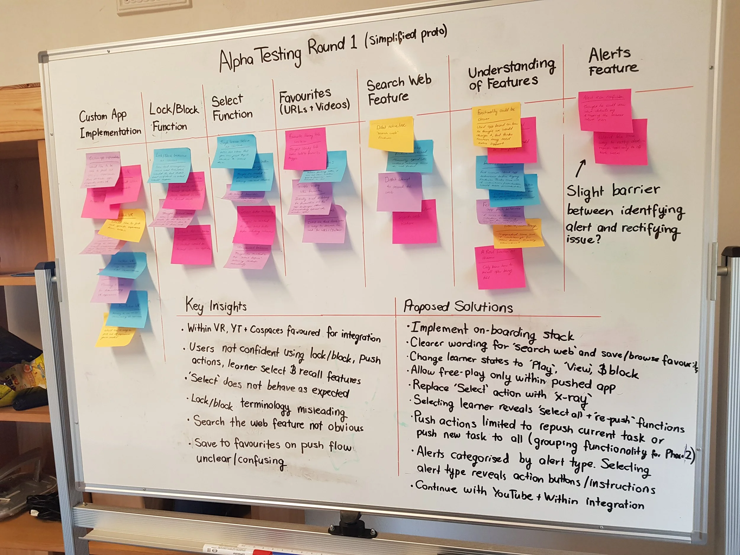
Before digital stickies in Miro of Figma become part of my regular workflow, I conducted thematic analysis using physical notes and whiteboarding to identify key usability themes, extract insights, and propose solutions.
Some examples of post-testing iterations
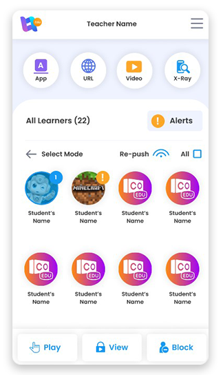
Due to the confusion around the ‘unlock’, ‘lock’, and ‘block’ buttons identified in the initial testing phase, the terminology was changed to ‘play’, ‘view’ and ‘block’, with supporting iconography. An onboarding stack was also implemented. These changes were shown to reduce feature confusion and increase user confidence in the second round of testing.
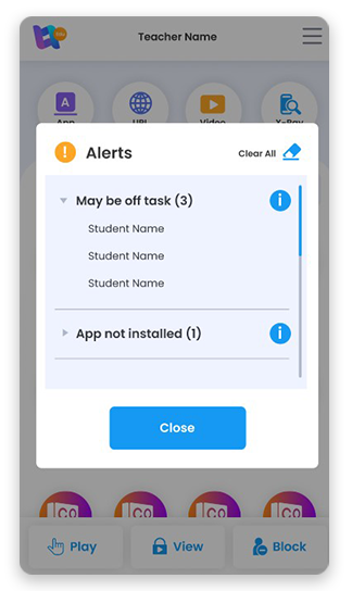
In response to the difficulty participants users had identifying and rectifying Alerts, we introduced categorisation and an info dialogue that provides more information on the problem, a recommended action, and an appropriate action button to allow quick rectification of issues.
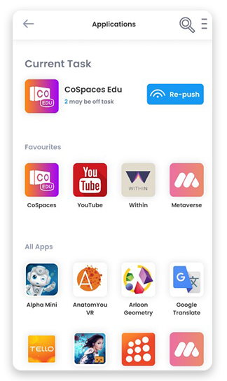
To simplify the means of keeping students ‘on-task’ and controlling content playback, it was decided that the class would be limited to one app, URL or video task at a time.
The intention is to implement grouping functionality in later versions, which will allow a different tasks to be pushed to different students.
Reflection & Takeaways
Accessibility
Whilst a high contrast mode was later designed to address AAA accessibility needs, it’s clear that some of the buttons and colours used in the standard design would not even meet AA WCAG compliance. Using a contrast checker has now become part of my standard process.
Support for Novel Features
Whilst it’s ideal that products can be intuitively understood and used without needing instruction, novel features that deviate from familiar UI/UX patterns may require additional guidance, such as tool-tips and on-boarding flows, so new users can use features with confidence.
Digital vs Paper Workflows
Whilst physical paper, stickies, and whiteboarding can be beneficial in a community engagement and collaboration context, I’ve found this approach to qualitative analysis to be too slow and rigid. I have since streamlined my process using digital tools like Miro and AI transcription.
Developer Handover
During development, there was quite a lot of art direction required to get the functional prototype looking more like the design. I have since fleshed out my dev handover / design system process to provide more support for developers and save time in the art direction phase.


