Co-Care Service Finder
Making care services more accessible.
Summary
Disclaimer: CoCare is a fictional case study based on an amalgamation of two real projects that have not yet been made publicly available. This case study was crafted to demonstrate up-to-date process whilst protecting the IP of Fuller and its clients.
Clunky, bloated with content, and no longer fit for purpose, in 2024 the CoCare website was ready for a refresh. The current site was so difficult to use, customer support was constantly flooded with calls from users who just couldn’t find what they needed online.
The new website needed to ensure that users could navigate, access and understand content intuitively and with confidence, as well as support business targets like fundraising and recruitment.
Being that Co-Care offer a plethora of services for a broad range of diverse customers, many of whom have specific accessibility needs, we opted for an object oriented approach to the information architecture and designed a service finder tool that would enable overwhelmed users to discover all they can access based on a simple understanding of their needs.
Responsibilities
UX/CX Research, UX Design, Information Architecture, UI Design
Sector
Not-for-profit, Community Services
Timeline
April 2024 - October 2024
CX research was conducted via interviews with customers, and a series of in-person and virtual interactive workshops with staff. Virtual workshops and synthesis was conducted via Miro.
Customer Experience Research
CX research was conducted to gain better understanding of the problem space. We were able to capture qualitative data through broad stakeholder engagement activities, conducted via interactive workshops and interviews. Combined with additional supplied background research, we were able to synthesise all this data into actionable insights, and detailed customer journey maps which highlighted the current experience, touch points, barriers, and drivers.
Key Insights
Accessing care services and funding is overwhelming, with many hoops to jump through and mountains of paperwork
Customers struggle to find easy-to-understand information about services, and may not even know what they need, leading to increased calls to customer support
Many are entering into a new situation and feel anxious, uncertain, isolated or even hopeless about the future.
Customers are diverse in needs, experience, and cultural background - they want to feel understood and represented
How Might We
Provide relief for those struggling to navigate complex government systems and services like NDIS and My Aged Care
Provide essential information in a way that’s easy to understand and process for diverse users, including those with disabilities
Un-burden staff by empowering users to discover what services they can access, how, and who to contact via the website
Help customers feel seen, heard, and cared for by CoCare and its staff (despite resourcing challenges)
Due to the high volume of target audiences across the different service areas, user personas were amalgamated into ‘user archetypes’, intending to recognise the diversity of users whilst focusing on their shared needs and challenges to be addressed via the website.
User Personas
Leaning on insights discovered through the CX research, as well as Google Analytics data on current user behaviour, we were able to develop user archetypes which captured the needs and challenges of diverse users.
The Archetypes
Overcoming Adversity - Includes youth leaving foster care, Aboriginal & Torres Strait Islanders, and adults with disabilities
Aging Well - Includes folks over 65 needing Aged Care services, and their partners
Conquering a Crisis - Includes those experiencing domestic violence, homelessness, and suicidal thoughts
Part-time Carer - Includes the parents, partners and children of those needing care
Connecting Customers - Includes support coordinators and healthcare professionals
Career Material - Includes students and skilled workers seeking employment
Giving Back - Includes volunteers, philanthropists, and corporate partners
Core Needs
Discover services and programs that fit my (or my child’s) eligibility and needs.
Engage with high level content in a way that is familiar and easy for me
Understand the process for accessing a particular service and options available
Get an idea of what to expect and how to prepare when engaging services
Feel heard, understood, respected and cared about
Learn about the experiences of others like me who have accessed services
Discover career opportunities
Find the correct contact
Recognise that I am not alone and there is someone to help me through this.
This simplified version of the recommended sitemap shows how ‘Programs’ were separated out as a post type, similar to the functionality for news posts. The service finder is featured as its own page under ‘Community & Resources’, but is also featured as a section on the homepage and linked to throughout the site.
Information Architecture & Tree Testing
Based on the diverse needs of users, and the cross over of services that may be relevant to them, we recommended an object oriented approach to the information architecture. For example, education services for autistic children could arguably fall under ‘Disability’, ‘Parents & Families’, or ‘Education & Training’. So, by treating specific offerings as ‘Programs’, and service areas as ‘Services’, we could develop program post types that could be assigned multiple categories and therefore discovered via multiple pathways. This would also condense the list of service pages displayed in the global navigation menu, freeing up space for essential content outside the service space, like ‘How to Help’.
With some skepticism from the client on whether this solution was necessary, we conducted a lean tree test study, based on a client approved sitemap with many tiers and additional items with similar terminology. The results of the study revealed that many participants were confused by the double up of terminology, or had trouble locating where a program like ‘education for autistic children’ would sit. So it was decided that the object oriented approach was warranted.
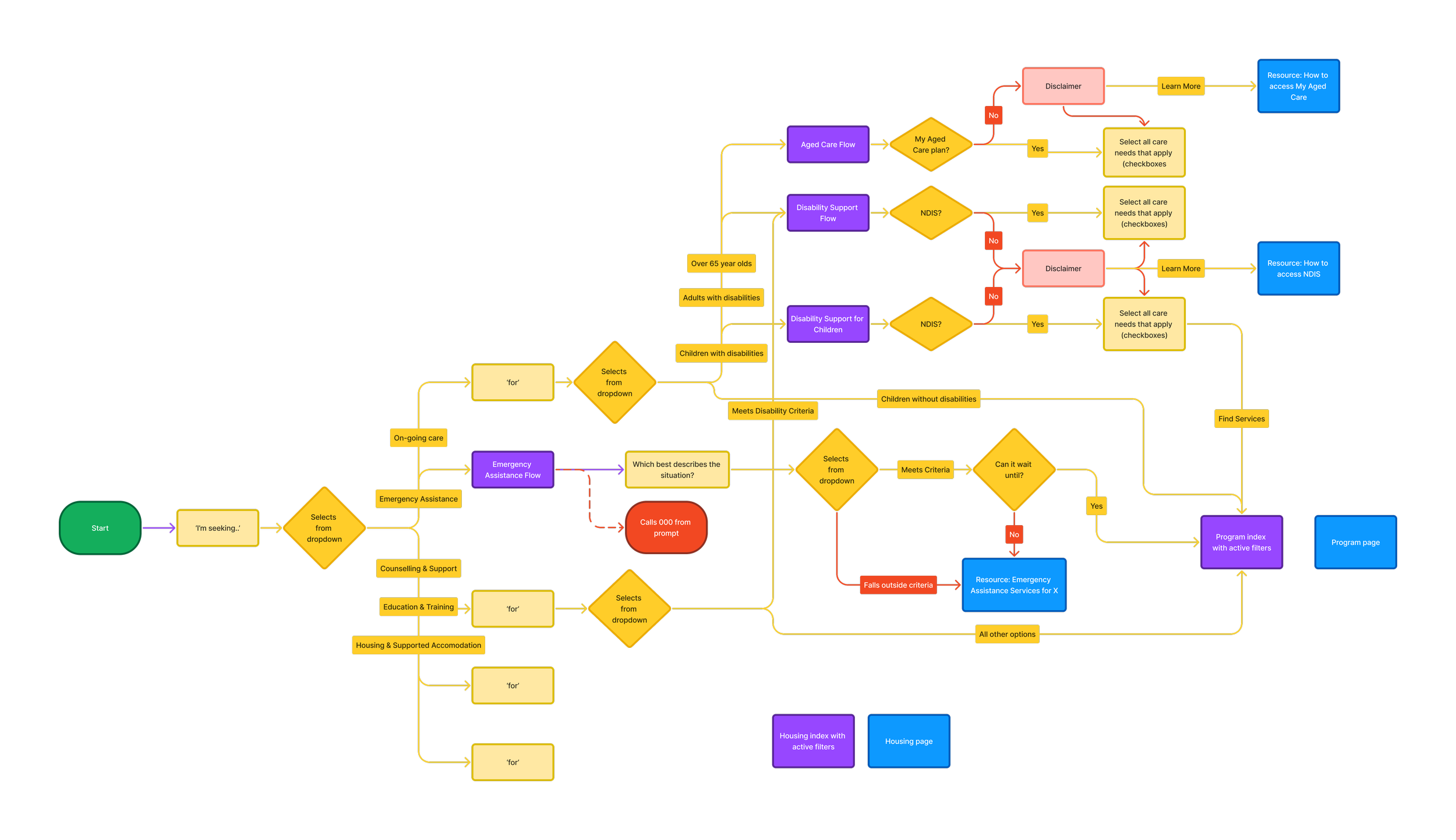
A flow chart was created to demonstrate the conditional logic and user flow of the Service Finder tool.
Prototyping & Design Rollout
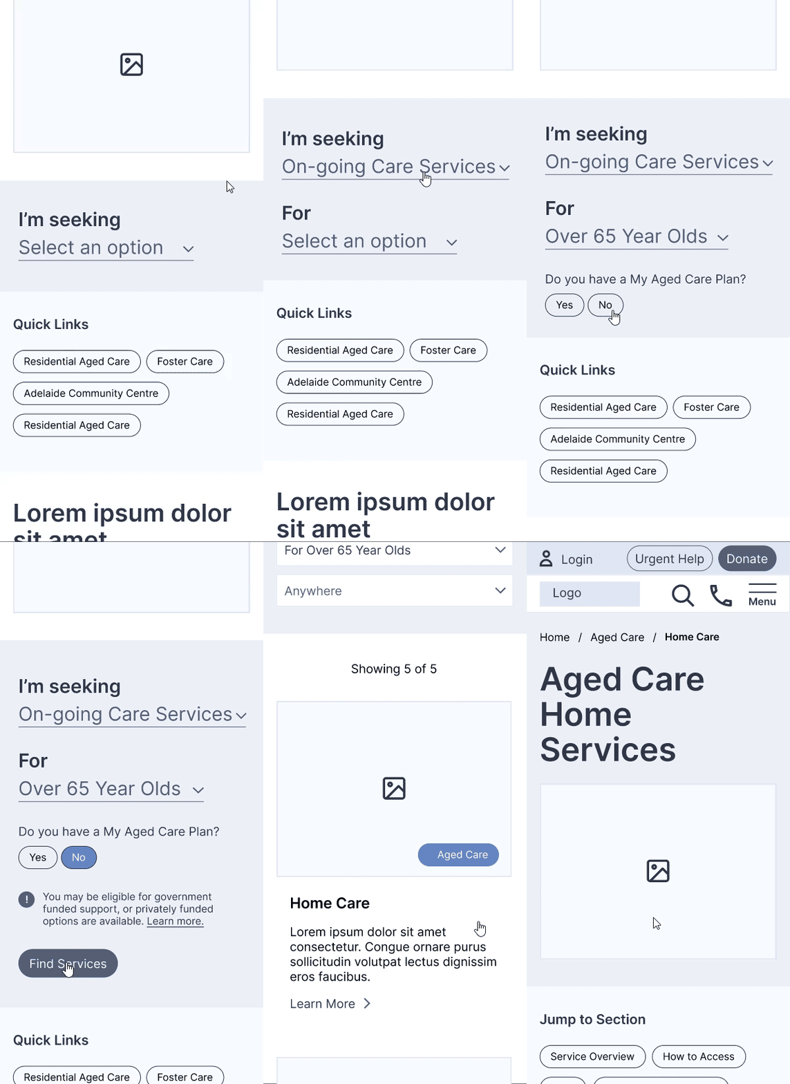
In addition to the information architecture, we also proposed the development of a service finder tool. This feature would prompt users, one step at a time, to select from a list of options what they were seeking, and for whom. Based on user input, the Service Finder would then direct the user to either a list of programs that fit their needs (the ‘programs’ page with applied filters), or a relevant resource.
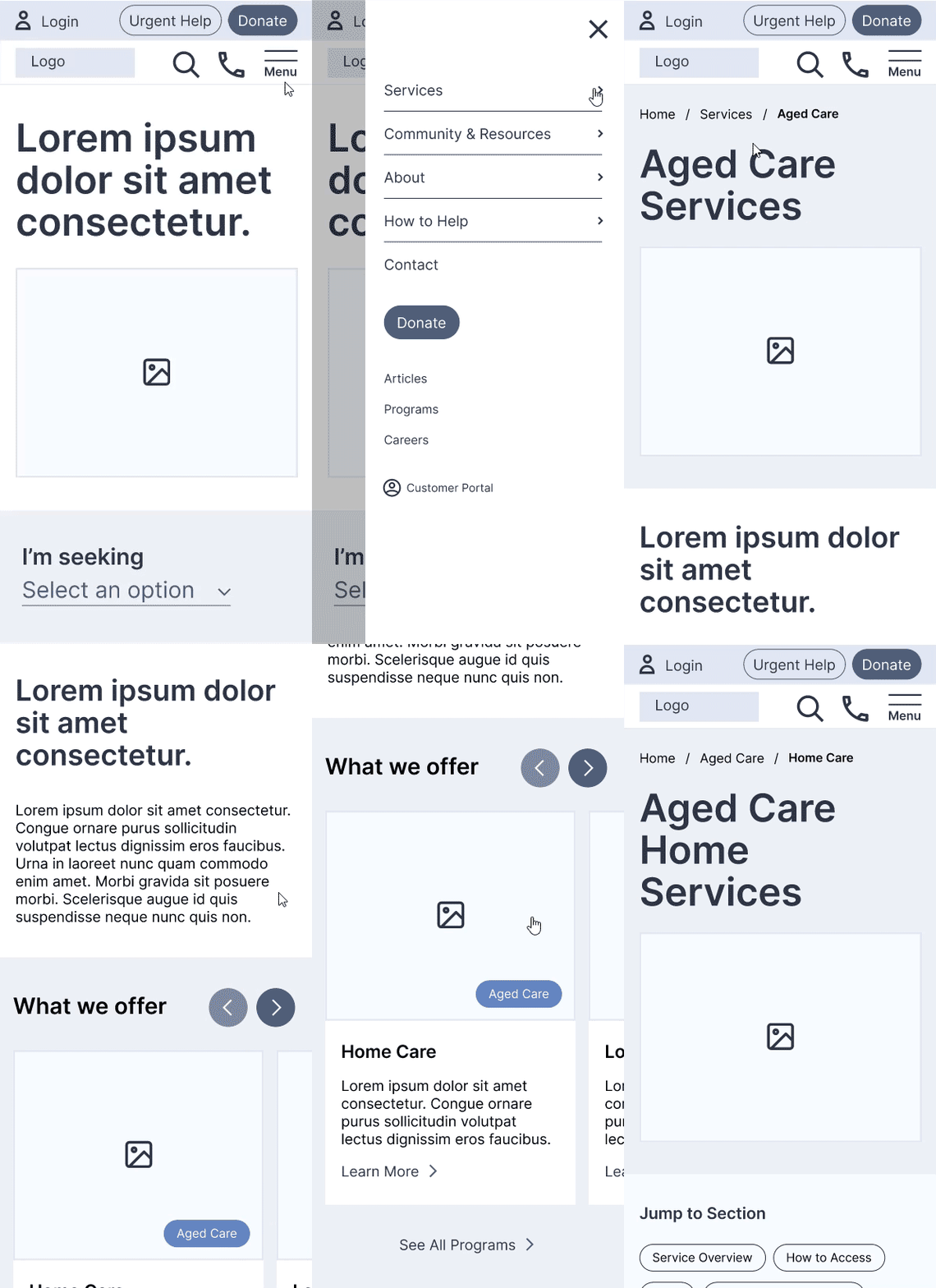
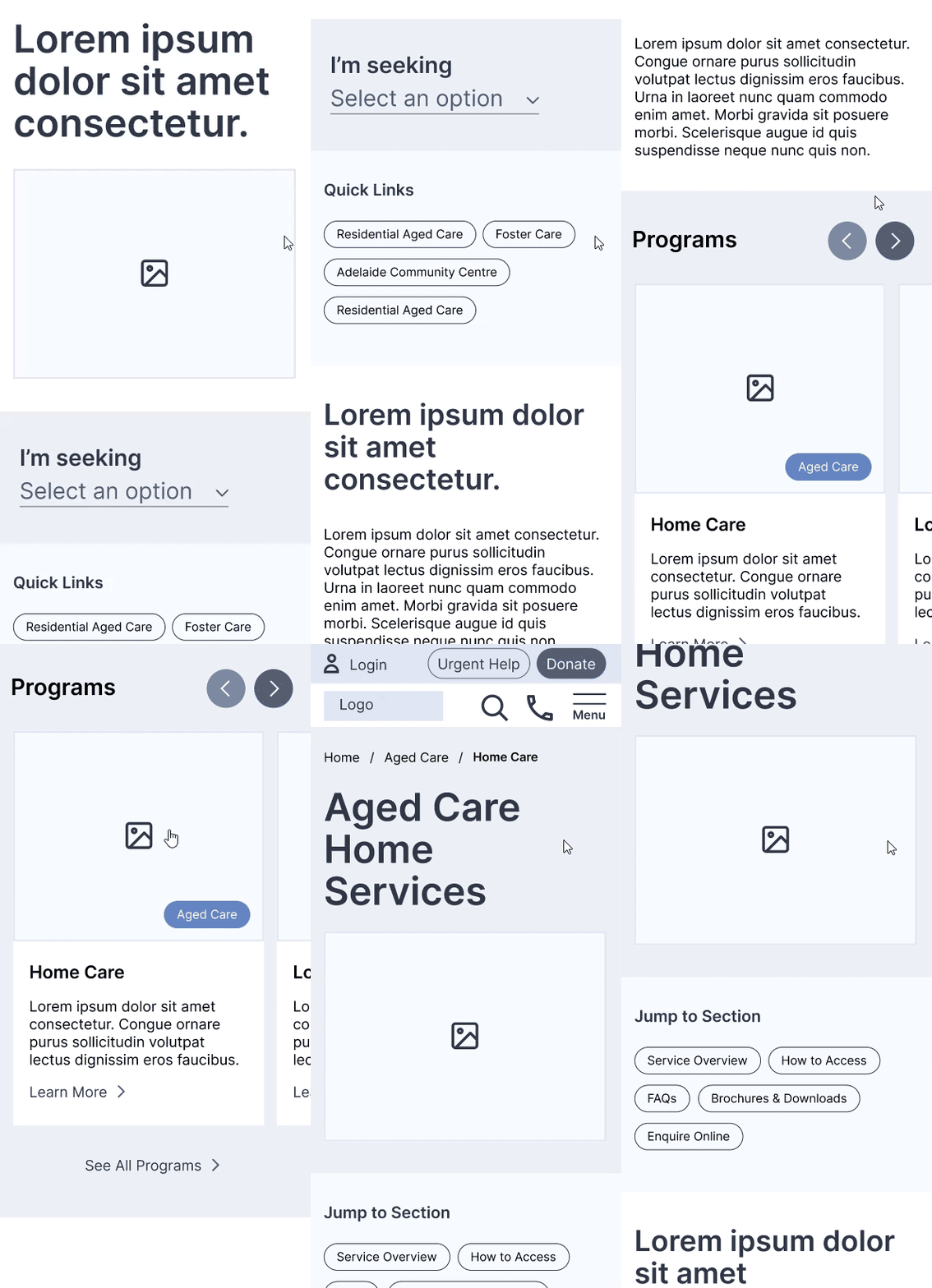
Wireframes were developed in Figma with a mobile-first approach to demonstrate how the experience would flow and the features and functionality would behave.
On approval, a high fidelity design was created for mobile and desktop based on the brand guidelines. A content deck was created based on the recommended IA, ready for the project copy writer to populate. A detailed design system was created and the design was handed over for development.
Service Finder Path - Users can discover a program via the service finder tool, discoverable just below the hero section.
Global Navigation Path - Users can discover a program by navigating to a service page and exploring the featured programs section.
Global Navigation Path - Users can discover a program by navigating to a service page and exploring the featured programs section just below the hero section.
Reflection & Takeaways
Usability vs Tree Testing
Due to stringent budgets, usability testing was not included within the scope of this project, despite having strongly advocated for it based on the complexity of the projects and target user needs. I was however able to push for tree testing which, whilst still a compromise, proved to be an invaluable way to steer the project in a more user-centred direction.
Object Oriented Communication
The concept of removing pages from the navigation and featuring them all in one place as if they were some kind of article can be confusing and scary for clients. I have since developed some visual material to demonstrate how the approach works in practice, in a way that’s easier for clients to understand and appreciate.


